v0.30.0

We are excited to announce Ratatui 0.30.0, one of our biggest releases yet! 🐁🚀🌕
In this release we’ve modularized the crates, added full
no_std support for embedded targets, introduced the new
ratatui::run() API, and brought major widget and layout
improvements — all with better backend flexibility and styling improvements.
See the changelog for the full list of changes. See the breaking changes for this release here.
Modularization 🧩
Section titled “Modularization 🧩”Starting with Ratatui 0.30.0, the codebase was reorganized from a single monolithic crate into a modular workspace consisting of multiple specialized crates. This architectural decision was made to improve modularity, reduce compilation times, enable more flexible dependency management, and provide better API stability for third-party widget libraries.
Here is the new structure of the Ratatui workspace:
ratatui├── ratatui-core├── ratatui-widgets (depends on ratatui-core)├── ratatui-crossterm (depends on ratatui-core)├── ratatui-termion (depends on ratatui-core)├── ratatui-termwiz (depends on ratatui-core)└── ratatui-macrosSee the architecture overview for more details.
Migration Guide
Section titled “Migration Guide”If you are an application developer, you can continue using ratatui as before 🎉
If you are a widget author, consider switching to ratatui-core for better stability:
// Before (0.29.x and earlier)use ratatui::{    widgets::{Widget, StatefulWidget},    buffer::Buffer,    layout::Rect,};
// After (0.30.0+)use ratatui_core::{ widgets::{Widget, StatefulWidget}, buffer::Buffer, layout::Rect,};no_std Support 🛠️
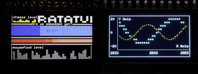
Section titled “no_std Support 🛠️”we are so embedded
Ratatui now supports compilation for no_std targets! 🎉
This means it can run on bare metal or microcontrollers. Ratatui was successfully tested to run on ESP32, STM32H7, PSP (yes, the console) and UEFI using experimental backends.
To use it in your no_std project, disable default-features:
ratatui = { version = "0.30.0", default-features = false }All of the features that don’t depend on std feature are also supported in no_std and can be
re-enabled if needed.
Execution 🛠️
Section titled “Execution 🛠️”We introduced ratatui::run() method which runs a closure with a terminal initialized with
reasonable defaults for most applications.
This calls ratatui::init() before running the closure and ratatui::restore() after the closure
completes, and returns the result of the closure.
A minimal hello world example using the new ratatui::run() method:
fn main() -> Result<(), Box<dyn std::error::Error>> { ratatui::run(|terminal| { loop { terminal.draw(|frame| frame.render_widget("Hello World!", frame.area()))?; if crossterm::event::read()?.is_key_press() { break Ok(()); } } })}Of course, this also works both with apps that use free methods and structs:
fn run(terminal: &mut DefaultTerminal) -> Result<(), AppError> { ... }
ratatui::run(run)?;
struct App { ... }
impl App { fn new() -> Self { ... } fn run(mut self, terminal: &mut DefaultTerminal) -> Result<(), AppError> { ... }}
ratatui::run(|terminal| App::new().run(terminal))?;Widgets 🧩
Section titled “Widgets 🧩”BarChart 📊
Section titled “BarChart 📊”Simplified label handling
Section titled “Simplified label handling”Bar::label() & BarGroup::label() now accept Into<Line<'a>> instead of Line<'a>:
Bar::default().label("foo".into());Bar::default().label("foo");BarGroup::default().label("bar".into());BarGroup::default().label("bar");New constructors
Section titled “New constructors”BarChart::new,BarChart::vertical,BarChart::horizontal,BarChart::groupedBar::new,Bar::with_labelBarGroup::new,BarGroup::with_label
This makes it easier to create barcharts and bars without needing to use the builder pattern:
BarChart::grouped(vec![ BarGroup::with_label( "Group 1", vec![Bar::with_label("A", 10), Bar::with_label("B", 20)], ), BarGroup::with_label( "Group 2", [Bar::with_label("C", 30), Bar::with_label("D", 40)], ),]);Other improvements
Section titled “Other improvements”Bar now implements Styled
Canvas 🎨
Section titled “Canvas 🎨”New marker types are added to Canvas for better resolution:
Marker::Quadrant: densely packed and regularly spaced pseudo-pixels with a 2x2 resolution per character, without visible bands between cells. (e.g. ’▌’, ’▞’, ’▛’)Marker::Sextant: same asQuadrantbut with a 2x3 resolution per character (e.g. ’🬪’, ’🬫’, ’🬬’)Marker::Octant: same asBraillebut with a 2x4 resolution per character (e.g. ’’, ’’, ’’)
Scrollbar 🖱️
Section titled “Scrollbar 🖱️”You can now retrieve the ScrollbarState position via ScrollbarState::get_position()
Block 🧱
Section titled “Block 🧱”Support for merging borders
Section titled “Support for merging borders”When two borders overlap, they will automatically merge into a single, clean border instead of overlapping.
This improves visual clarity and reduces rendering glitches around corners.
For example:
assert_eq!(Cell::new("┘").merge_symbol("┏", MergeStrategy::Exact).symbol(), "╆");See the MergeStrategy documentation for more details on how this works.
But in a nutshell, it makes it possible to collapse borders as follows:
┌───┐ ┌───┐ ┌───┬───╮┌───┐│ │ │ │ │ │ ││ ││ │ │ ╭─┼─╮│ │ ││ ││ │ │ │ │ ││ │ ││ │└───┼───╮└─┼─┘ │└───┴───╯├───┤ │ │ │ │ │ │ │ │ ╰───╯ │ │ │ │ │ │ ╰───╯ ╰───╯New BorderTypes
Section titled “New BorderTypes”Click here to see them!
LightDoubleDashed:
┌╌╌╌╌╌╌╌┐╎ ╎└╌╌╌╌╌╌╌┘HeavyDoubleDashed:
┏╍╍╍╍╍╍╍┓╏ ╏┗╍╍╍╍╍╍╍┛LightTripleDashed:
┌┄┄┄┄┄┄┄┐┆ ┆└┄┄┄┄┄┄┄┘HeavyTripleDashed:
┏┅┅┅┅┅┅┅┓┇ ┇┗┅┅┅┅┅┅┅┛LightQuadrupleDashed:
┌┈┈┈┈┈┈┈┐┊ ┊└┈┈┈┈┈┈┈┘HeavyQuadrupleDashed:
┏┉┉┉┉┉┉┉┓┋ ┋┗┉┉┉┉┉┉┉┛Remove Block::title
Section titled “Remove Block::title”The title alignment is better expressed in the Line as this fits more coherently with the rest of
the library.
widgets::blockis no longer exportedwidgets::block::Titleno longer existswidgets::block::Positionis nowwidgets::TitlePositionBlock::title()now acceptsInto::<Line>instead ofInto<Title>BlockExtis now exported at widgets::BlockExtinstead ofwidgets::block::BlockExt
This is a breaking change.
LineGauge 📏
Section titled “LineGauge 📏”Support customizable symbols
Section titled “Support customizable symbols”LineGauge now support customizable symbols via LineGauge::filled_symbol and
LineGauge::unfilled_symbol methods:
let gauge = LineGauge::default() .filled_symbol("█") .unfilled_symbol("░") .ratio(0.80);80% ████████████░░░░Deprecations
Section titled “Deprecations”LineGauge::line_set method is now deprecated.
List 📃
Section titled “List 📃”List::highlight_symbol now accepts Into<Line> instead of &str.
This makes it possible to customize the highlight symbol as follows:
let list = List::new(["Item 0", "Item 1", "Item 2"]) .highlight_symbol(Line::from(">>").red().bold());This is a breaking change and any code that uses conversion methods will need to be rewritten. Since
Into::into is not const, this function cannot be called in const context.
Tabs 📑
Section titled “Tabs 📑”Add Tabs::width method to easily calculate the total tab width including all dividers and padding
RatatuiMascot widget 🐁
Section titled “RatatuiMascot widget 🐁”Introducing RatatuiMascot: A widget that displays the Ratatui mascot!
let mascot = RatatuiMascot::new().set_eye(MascotEyeColor::Red); ▄▄███ ▄███████ ▄█████████ ████████████ ▀███████████▀ ▄▄██████ ▀███▀▄█▀▀████████ ▄▄▄▄▀▄████████████ ████████████████ ▀███▀██████████ ▄▀▀▄ █████████ ▄▀ ▄ ▀▄▀█████████ ▄▀ ▀▀ ▀▄▀███████ ▄▀ ▄▄ ▀▄▀█████████ ▄▀ ▀▀ ▀▄▀██▀ ████ ▀▄▀ ▄██ ▀▄ ▀▄▀█Examples 🧪
Section titled “Examples 🧪”The examples have been simplified and reorganized.
ratatui-widgets/examples: contains simple widget examples (that are meant to be copy & pasted easily).examples/: contains more complex application and concept examples that are useful for getting inspiration for designing your own applications.
Also new examples such as
mouse-drawing,
widget-ref-container
and
collapsed-borders
are added.
Text 📝
Section titled “Text 📝”AddAssign for Text
Section titled “AddAssign for Text”Text now implements AddAssign trait.
This makes it possible to add a second Text instance to a first one using the += operator.
let mut text = Text::from("line 1");text += Text::from("line 2");Style and alignment applied to the second text is ignored (though styles and alignment of lines and spans are copied).
Other improvements
Section titled “Other improvements”-
Don’t render control characters for
Span -
Implement
UnicodeWidthStrforText/Line/Spanfor retrieving the width viawidthandwidth_cjk
Styling 🎨
Section titled “Styling 🎨”Conversions from anstyle
Section titled “Conversions from anstyle”Support conversions from anstyle styles (gated behind anstyle
feature):
let anstyle_color = anstyle::Ansi256Color(42);let color = Color::from(anstyle_color);Conversions from tuples
Section titled “Conversions from tuples”Added generic color conversion methods from tuples:
Color::from([255, 0, 0]);Color::from((255, 0, 0));Color::from([255, 0, 0, 255]);Color::from((255, 0, 0, 255));Conversions from primitives
Section titled “Conversions from primitives”Implement Styled for primitives such as u8, i32, f64, Cow<'a, str>, etc.
let s = Cow::Borrowed("a");assert_eq!(s.red(), "a".red());Implement stylize methods directly on Style
Section titled “Implement stylize methods directly on Style”This makes it possible to create constants using the shorthand methods.
const MY_STYLE: Style = Style::new().blue().on_black();This is a breaking change.
Layout 📐
Section titled “Layout 📐”Ergonomic layouting methods
Section titled “Ergonomic layouting methods”We introduced new methods for Rect that simplify the process of splitting a Rect into sub-rects
according to a given Layout.
Rect::layout and Rect::try_layout:
use ratatui_core::layout::{Layout, Constraint, Rect};let area = Rect::new(0, 0, 10, 10);let layout = Layout::vertical([Constraint::Fill(1); 2]);
// Rect::layout() infers the number of constraints at compile time:let [top, main] = area.layout(&layout);
Layout::try_areas method that returns an array of sub-rects, with compile-time checks for the
number of constraints.
This is added mainly for consistency with the new Rect methods.
// Rect::try_layout() and Layout::try_areas() do the same, but return a// Result:let [top, main] = area.try_layout(&layout)?;let [top, main] = layout.try_areas(area)?;Rect::layout_vec method that returns a Vec of sub-rects.
let areas_vec = area.layout_vec(&layout);Helper methods for centering Rects
Section titled “Helper methods for centering Rects”For centering:
let area = frame .area() .centered(Constraint::Ratio(1, 2), Constraint::Ratio(1, 3));Or for vertical centering:
let area = frame.area().centered_vertically(Constraint::Ratio(1, 2));Horizontally centering:
let area = frame.area().centered_horizontally(Constraint::Length(3));Add Rect::outer method
Section titled “Add Rect::outer method”This creates a new Rect outside the current one, with the given margin applied on each side.
Also added VerticalAlignment type.
Introduce Flex::SpaceEvenly
Section titled “Introduce Flex::SpaceEvenly”Old Flex::SpaceAround behavior is available by using Flex::SpaceEvenly and new
Flex::SpaceAround now distributes space evenly around each element except the middle spacers are
twice the size of first and last elements
With this change, the following variants of Flex are supported:
Flex::Start: Aligns items to the start; excess space appears at the end.Flex::End: Aligns items to the end; excess space appears at the start.Flex::Center: Centers items with equal space on both sides.Flex::SpaceAround(new): Distributes space around items; space between items is twice the edge spacing.Flex::SpaceBetween: Distributes space evenly between items except no space at the edges.Flex::SpaceEvenly(previouslyFlex::SpaceAround): Distributes space evenly between items and edges.Flex::Legacy: Preserves legacy behavior, placing all excess space at the end.
This aligns behavior of Flex with CSS flexbox more closely.
The following is a screenshot in action:
Other improvements
Section titled “Other improvements”- Rename
AlignmenttoHorizontalAlignmentto better reflect its purpose
use ratatui::layout::Alignment;use ratatui::layout::HorizontalAlignment;
use Alignment::*;use HorizontalAlignment::*;-
New constructors:
Offset::new -
Rect::from(size)returns a newRectat the origin (0, 0) with the specifiedSize
Backend 🖥️
Section titled “Backend 🖥️”Backend conversion traits
Section titled “Backend conversion traits”The From implementations for backend types are now replaced with more specific traits.
This effects the styling conversions such as Color:
 use ratatui::backend::crossterm::{FromCrossterm, IntoCrossterm};
let crossterm_color = crossterm::style::Color::Black;
 let ratatui_color = crossterm_color.into(); let ratatui_color = ratatui::style::Color::from(crossterm_color); let ratatui_color = ratatui::style::Color::from_crossterm(crossterm_color);
 let crossterm_color = ratatui_color.into(); let crossterm_color = crossterm::style::Color::from(ratatui_color); let crossterm_color = ratatui_color.into_crossterm();
Backend specific traits are added for crossterm (FromCrossterm, IntoCrossterm), termion
(FromTermion, IntoTermion), and termwiz (FromTermwiz, IntoTermwiz).
See this breaking changes entry for more information.
Associated Error type and required clear_region method
Section titled “Associated Error type and required clear_region method”Custom Backend implementations now require an associated Error type and clear_region method.
This change was made to provide greater flexibility for custom backends, particularly to remove the
explicit dependency on std::io for backends that want to support no_std targets.
Also, if your app or library uses the Backend trait directly - for example, by providing a generic
implementation for many backends - you may need to update the referenced error type.
fn run<B: Backend>(mut terminal: Terminal<B>) -> io::Result<()> {fn run<B: Backend>(mut terminal: Terminal<B>) -> Result<(), B::Error> {See this breaking changes entry for more information and other workarounds.
Support for multiple crossterm versions
Section titled “Support for multiple crossterm versions”We now have individual feature flags for different crossterm versions. By default, the latest version is enabled. If multiple features are enabled, we choose the latest version.
e.g.
ratatui = { version = "0.30.0", features = ["crossterm_0_28"] } # or "crossterm_0_29"If your dependency graph ends up with multiple Crossterm majors, see Crossterm version compatibility for the risks and mitigations.
Other improvements
Section titled “Other improvements”TestBackend now uses core::convert::Infallible for error handling instead of std::io::Error
Traits 🔧
Section titled “Traits 🔧”State associated types are now ?Sized
Section titled “State associated types are now ?Sized”StatefulWidget::State and StatefulWidgetRef::State are now ?Sized.
This allows implementations of the traits to use unsized types for the State associated type. This
is turn is useful when doing things like boxing different stateful widget types with State which
implements Any, are slices or any other dynamically sized type.
Changes to WidgetRef trait
Section titled “Changes to WidgetRef trait”WidgetRef no longer has a blanket implementation of Widget.
Previously there was a blanket implementation of Widget for WidgetRef. This has been reversed to
instead be a blanket implementation of WidgetRef for all &W where W: Widget.
impl WidgetRef for Foo { fn render_ref(&self, area: Rect, buf: &mut Buffer)impl Widget for &Foo { fn render(self, area: Rect, buf: &mut Buffer)}Any widgets that previously implemented WidgetRef directly should now instead implement Widget
for a reference to the type.
New FrameExt trait
Section titled “New FrameExt trait”To call Frame::render_widget_ref() or Frame::render_stateful_widget_ref() you now need to import
the FrameExt trait and enable the unstable-widget-ref feature.
use ratatui::{    layout::Rect,    widgets::{Block, FrameExt},};
let block = Block::new();let area = Rect::new(0, 0, 5, 5);frame.render_widget_ref(&block, area);
Performance 🚀
Section titled “Performance 🚀”Disabling default-features will now disable layout cache, which can have a negative impact on
performance
Layout cache is now opt-in in ratatui-core and enabled by default in ratatui.
If app doesn’t make use of no_std-compatibility, and disables default-feature, it is recommended
to explicitly re-enable layout cache. Not doing so may impact performance.
ratatui = { version = "0.29.0", default-features = false }ratatui = { version = "0.30.0", default-features = false, features = ["layout-cache"] }Also, Layout::init_cache and Layout::DEFAULT_CACHE_SIZE are only available if layout-cache
feature is enabled.
Ratatui Badge ⭐
Section titled “Ratatui Badge ⭐”We have added a “Built with Ratatui” badge for downstream projects
If you’d like to show your support, you can add the Ratatui badge to your project’s README:
[](https://ratatui.rs/)
If you want a custom badge, Ratatui logo is also available on shields.io! Some examples are:
Other 💼
Section titled “Other 💼”- MSRV is now 1.86.0
- The codebase now uses Rust 2024 edition
- Derive Serialize/Deserialize for
Constraint,Direction,Spacing,Layout,AccentedPalette,NonAccentedPalette,Palette,Padding,Borders,BorderType,ListDirection,ScrollbarOrientation,ScrollDirection,RenderDirection, andHighlightSpacing,HorizontalAlignment,VerticalAlignment - Allow omitting add/sub modifier fields in
Styledeserialization - VS16 wide emojis are now properly cleared from the buffer
- Change
Cell::symboltoOption<CompactString>to better represent empty cells - Make it possible to render Braille characters over
Blocksymbols inChartandCanvas - Add AI contribution guidelines and Copilot instructions
“Rats don’t just survive; they discover; they create. … I mean, just look at what they do with the terminal!” – Remy & Orhun